It’s recently become possible to embed fonts in your website, so that you aren’t limited to using the same old fonts that everyone already has on their computer. Yay! Unfortunately, there are a lot of gotchas. Lots of people discuss the technical gotchas, but when you get past that, you’ve still got to worry about legibility.
Consider the recently redesigned online fiction zine, Chiaroscuro.
As of this writing, they’re using an embedded font called Merriweather.
EDIT 8 April: Chiaroscuro has removed the problematic
font from its site.
Here’s what the first paragraph of body text for volume 47 looked like on my Mac, using Firefox 4:
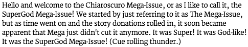
Pretty slick, yeah? Unfortunately … here’s what that same para looked like on Windows, with the same browser:
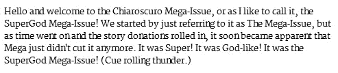
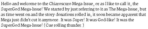
The letters are squished together in places, and the lowercase Ns are too tall. It’s even worse on Linux: not all the strokes are the same thickness, some of the letters are still too tall (look carefully at the lowercase D, for instance) and others extend below the baseline when they shouldn’t (such as the lowercase R).
What causes this radically different appearance of the same font in
the same browser? At typical body-text sizes, the computer has to draw
each letter using only 15 or so pixels in each direction. It’s not
possible to draw each letter exactly as the typographer intended, and
keep all the lines crisp and smooth, with that few pixels. Windows, OSX,
and Linux all resolve this dilemma differently: to oversimplify a bit,
OSX tries harder to preserve the font shapes, Windows tries harder to
make the lines sharp, and Linux tries to do both at once and winds up
achieving neither. (For lots of technical discussion of exactly what the
difference is, see these blog posts from 2007: Respecting
The Pixel Grid, Font
rendering philosophies of Windows & Mac OS X, Texts
Rasterization Exposures.) People argue, loudly, about which choice
is better (as the above blog posts and their comment threads
demonstrate) but I think it would be relatively uncontroversial to say
that the Windows font-drawing algorithm only works well with
help from the font itself. The Merriweather font on Chiaroscuro
demonstrates this: it doesn’t provide this help (it doesn’t have enough
hinting
information) so it looks fine on OSX, but horrible on
Windows (and Linux – although there it’s not quite so much the font’s
fault).
This isn’t just
a matter of aesthetics (scare quotes because
nobody wants visitors to think their website is ugly);
it can mean that people can’t read your text. I myself
find Chiaroscuro unpleasant to read on Windows or Linux, but my
acquaintance Rose Lemberg, who has weaker eyesight, says the site is
illegible. I don’t think Chiaroscuro set out to be illegible, but
I’ll bet cookies to donuts Chiaroscuro’s designer didn’t bother testing
their new font on anything but a Mac.
I don’t want to deter people from using embeddable fonts altogether; however, this is another reason why you can’t just test your site on one operating system. At the very least you need to be testing on OSX and Windows (and I understand there are significant differences between XP and Vista/7 in this area, by the way); I would thank you for trying Linux as well (maybe you don’t care about desktop Linux, but Android uses the same font-drawing code). You might think that the font libraries at fontsquirrel.com or Google Web Fonts would have been checked for good rendering on all OSes, but it turns out Merriweather is available from both sites! So, while I’d still recommend starting with one of those libraries’ body-text fonts, it doesn’t get you out of testing.
(Note: Merriweather’s designer is aware that it looks terrible
on Windows, and is working on it. Still, it seems to me that inclusion
in public catalogs of fonts EDIT 25 November 2014: As of the
26-Dec-2013 release, Merriweather looks much
better on Windows and Linux.designed for the web
was
premature.)